
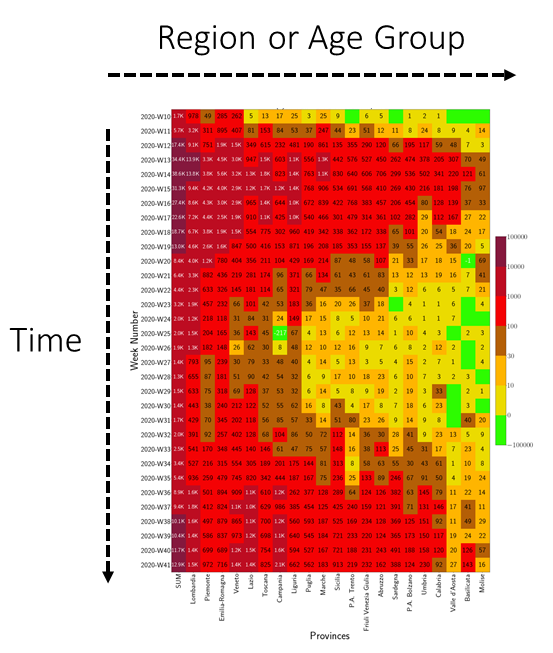
Fireplots
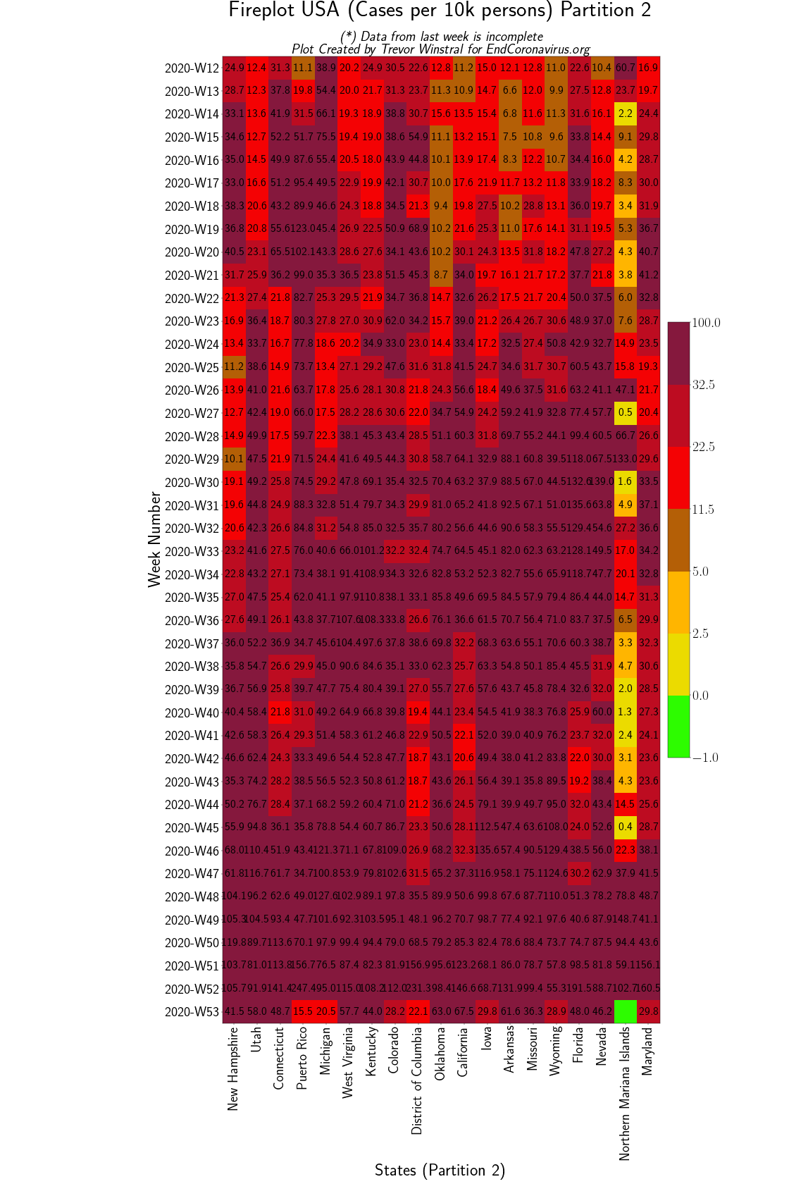
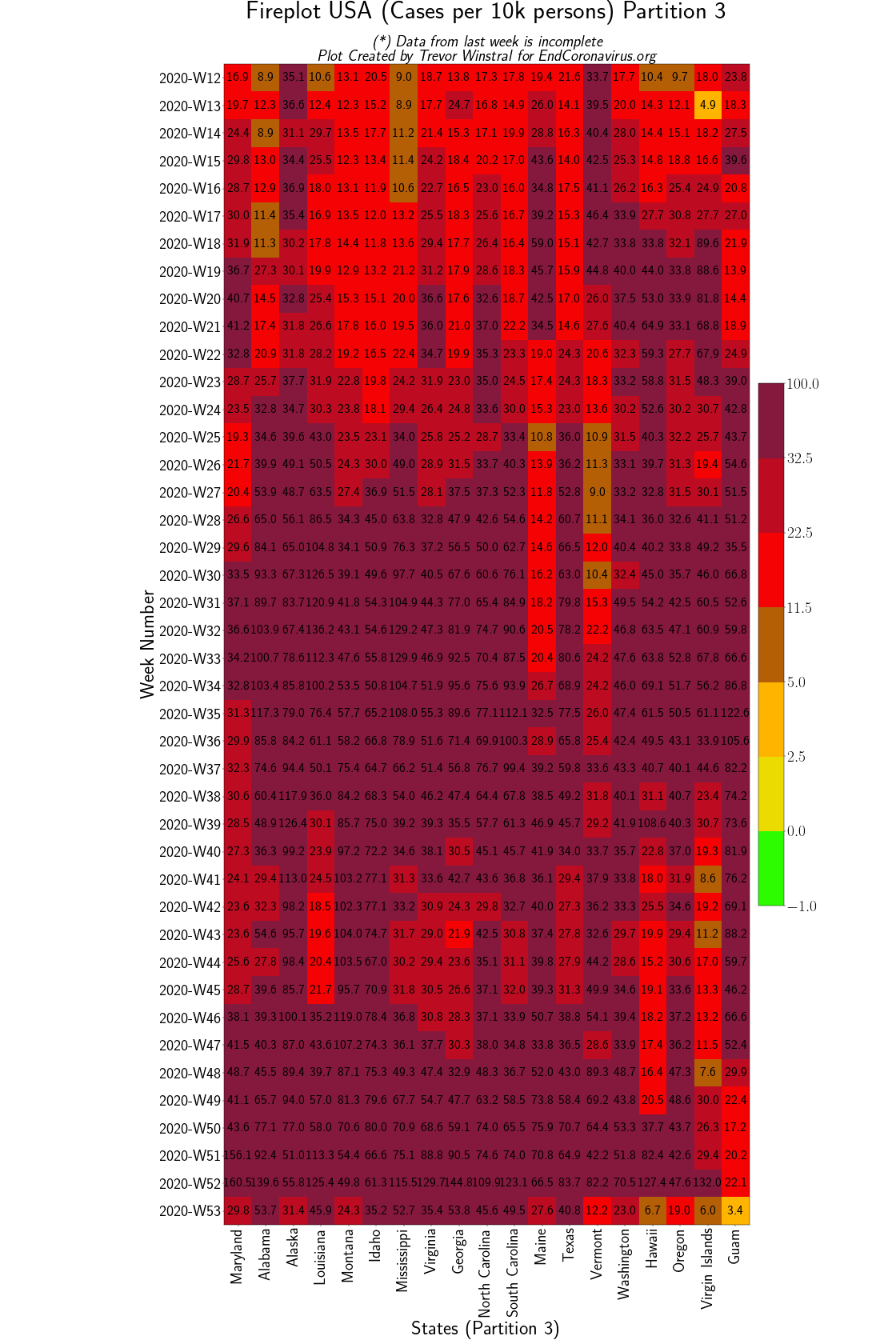
These figures show the numbers of new cases per week for different regions or age groups (left to right) over time (top to bottom). Click to expand the images.
Data for the most recent week (bottom row) may be incomplete.
Source Code: Trevor Winstral (here).
Australian Provinces \ Brazilian States \ Czechia \ Germany \ Netherlands \ G20 + Schengen Countries \ European Countries \ Italian Provinces \ US States \ Sweden \ Switzerland
Australia
Back to top
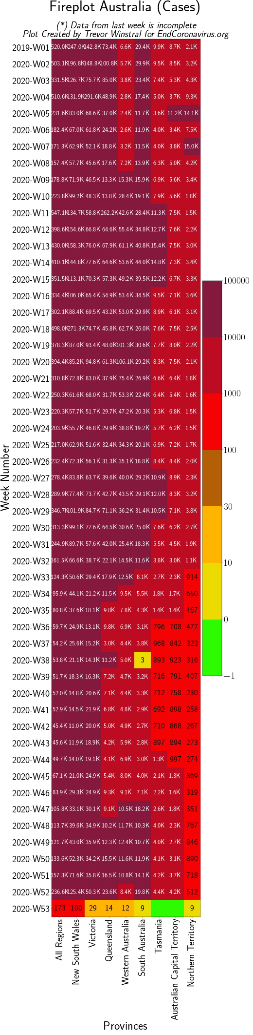 Australian Provinces File
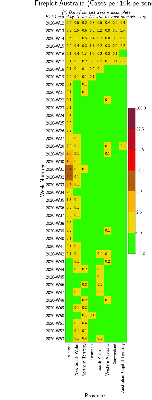 Australian Provinces (Per Capita) File
Brazil
Back to top
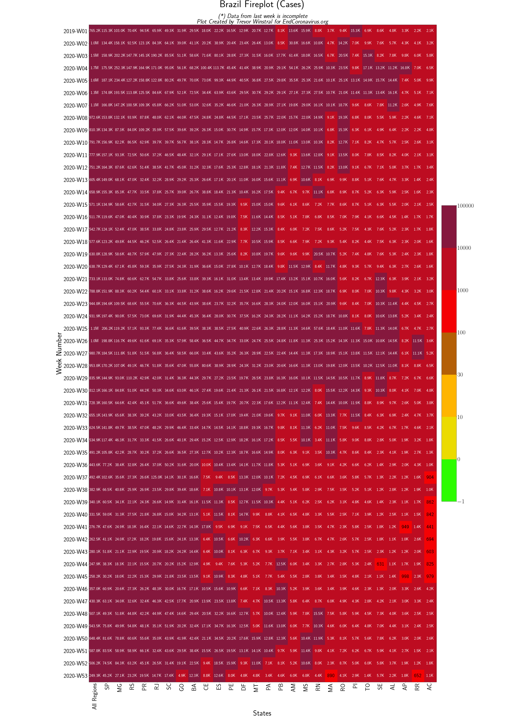 Brazilian States File
Czechia
Back to top
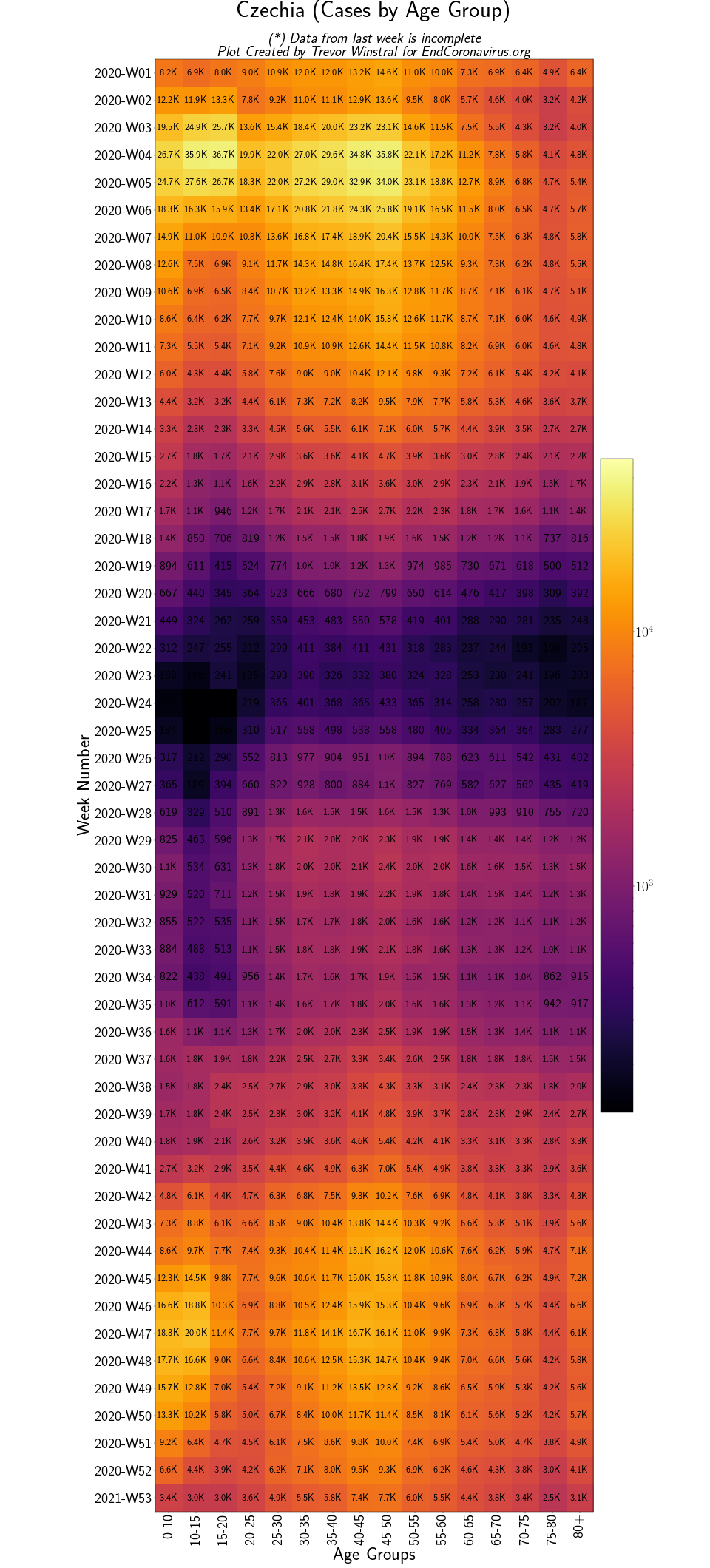 Czechia by Age File
G20 and Schengen
Back to top
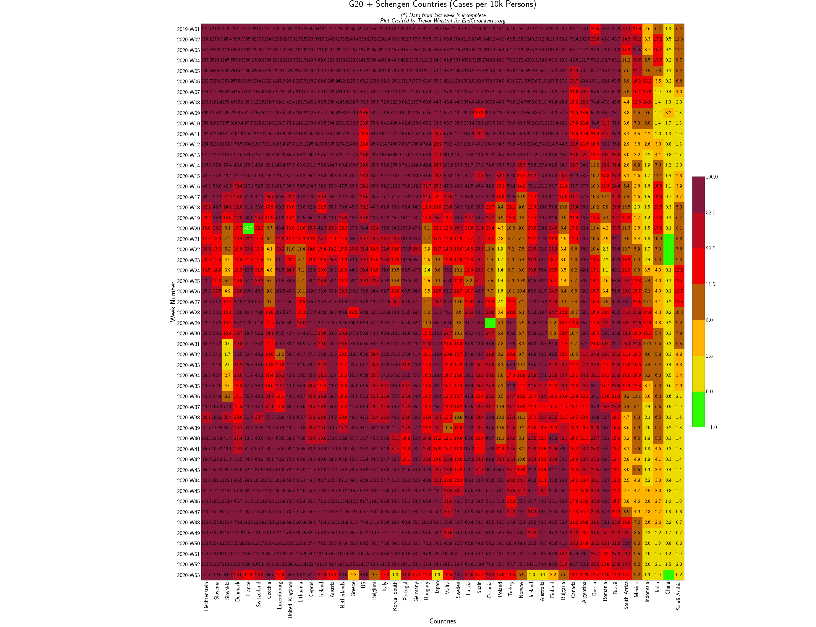 G20 and Schengen Countries (Per Capita) File
Germany
Back to top
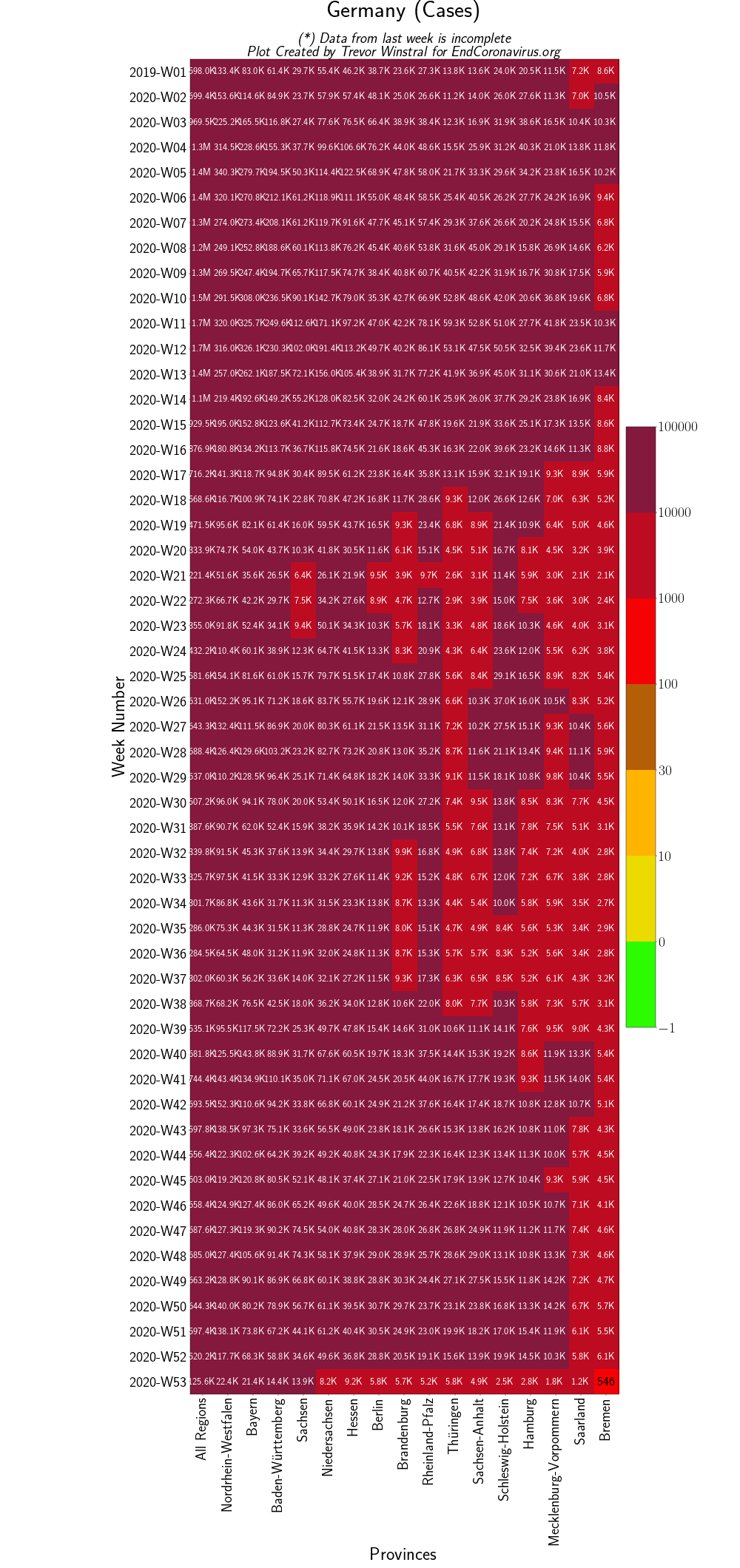 German Provinces File
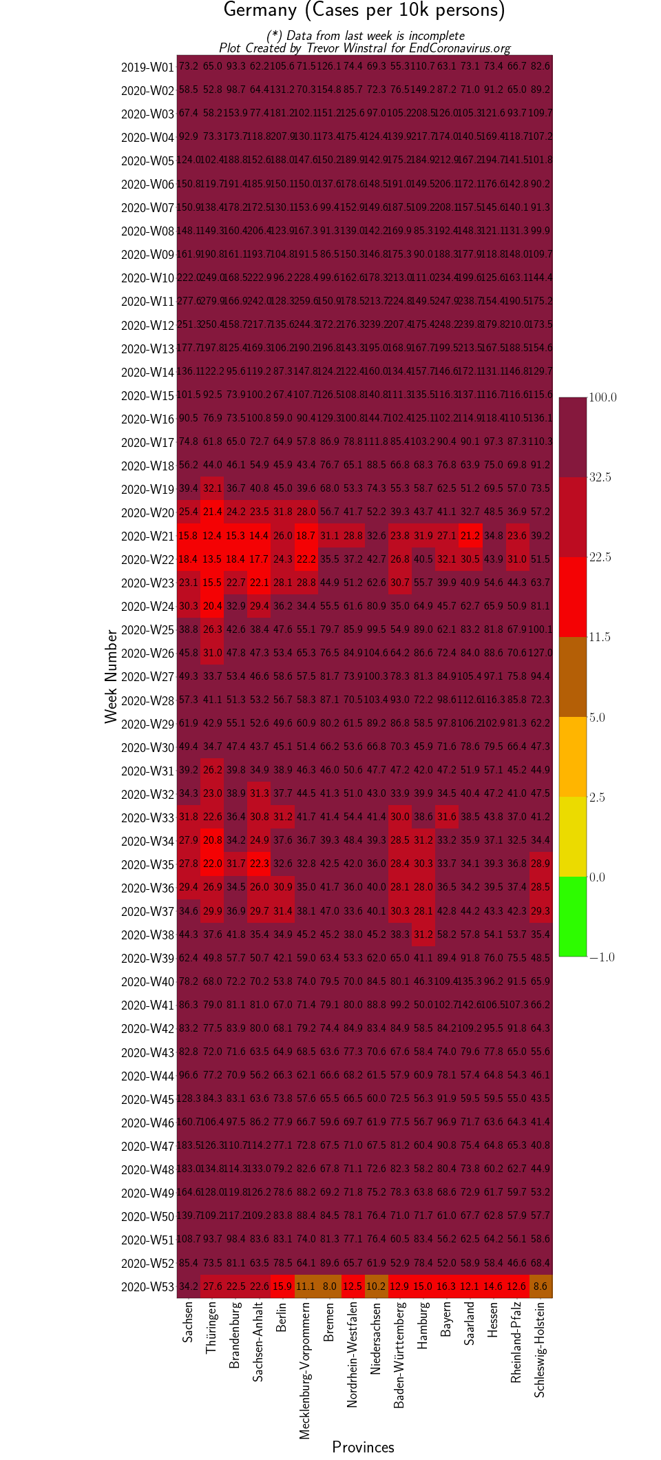 German Provinces (Per Capita) File
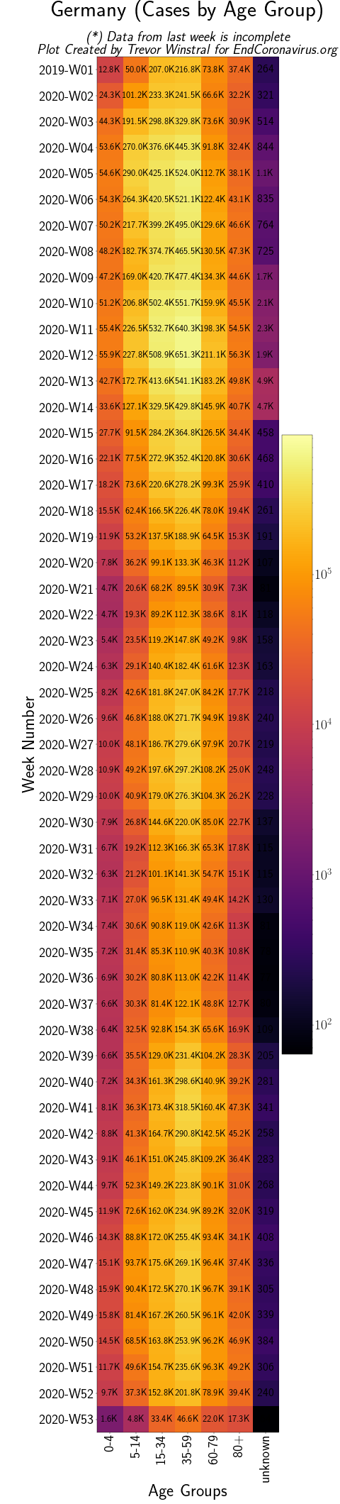 German Age Groups File
European Countries
Back to top
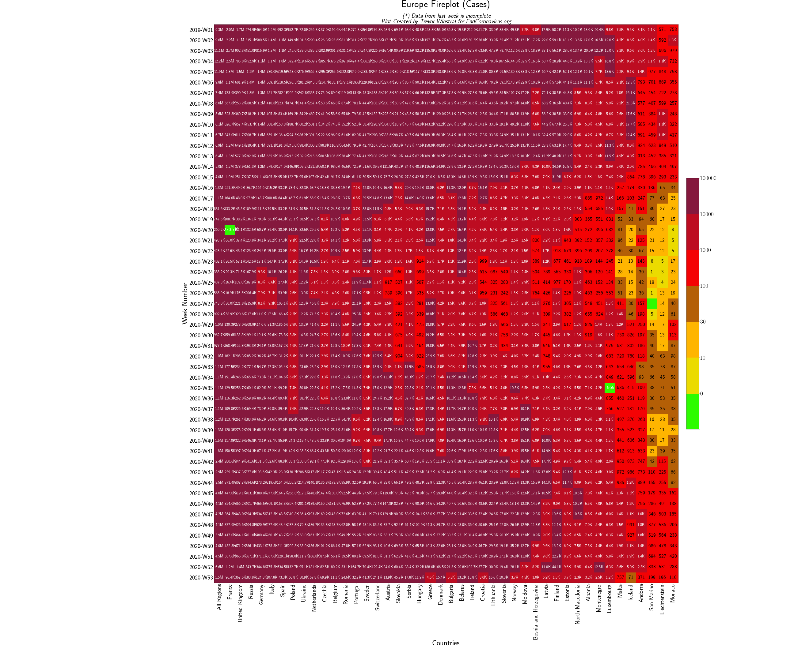 European Countries File
Netherlands
Back to top
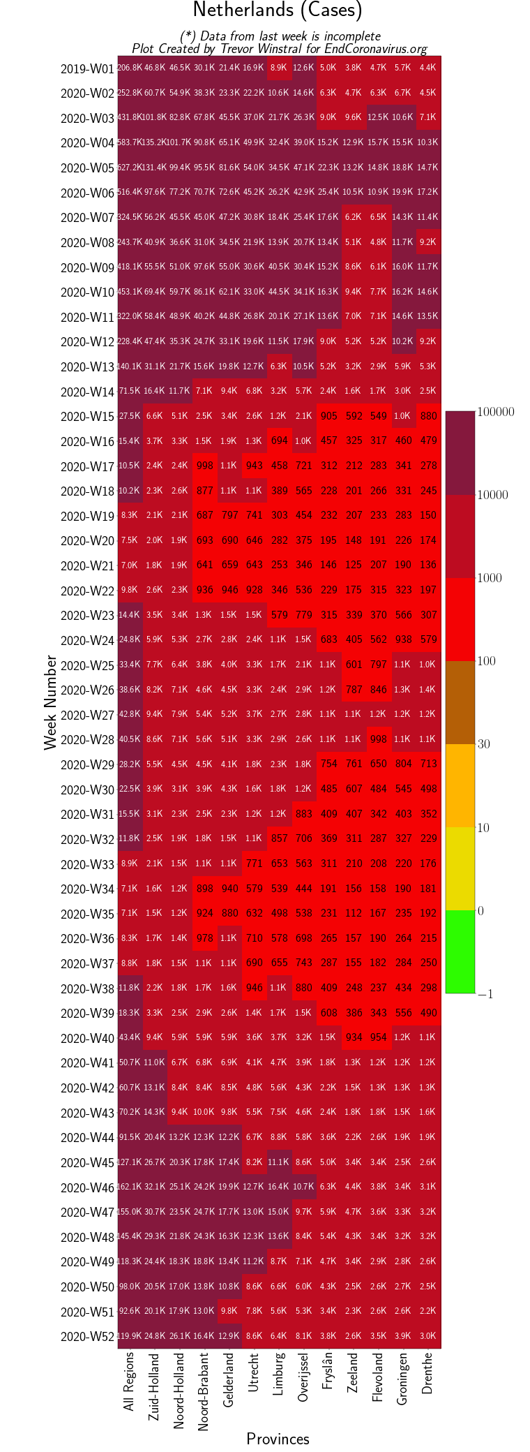 Netherlands Provinces File
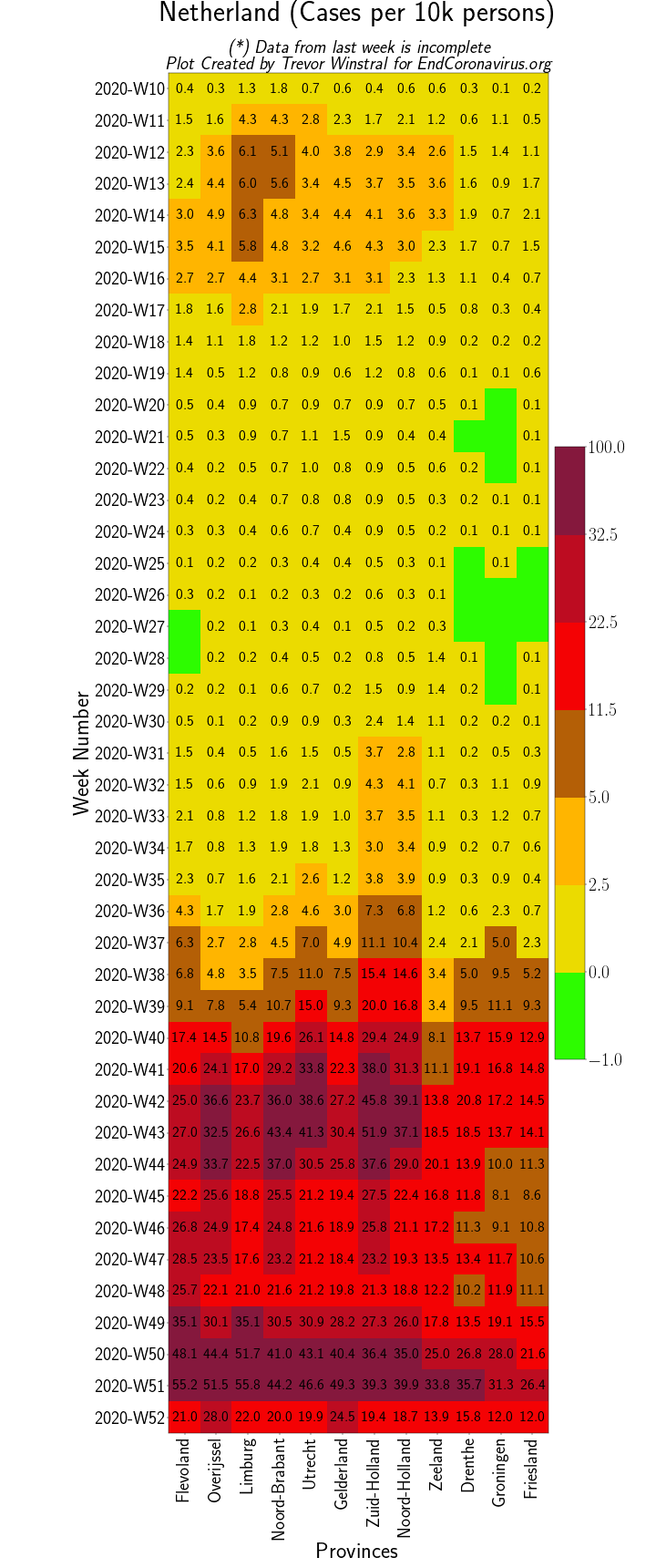 Netherlands Provinces (Per Capita) File
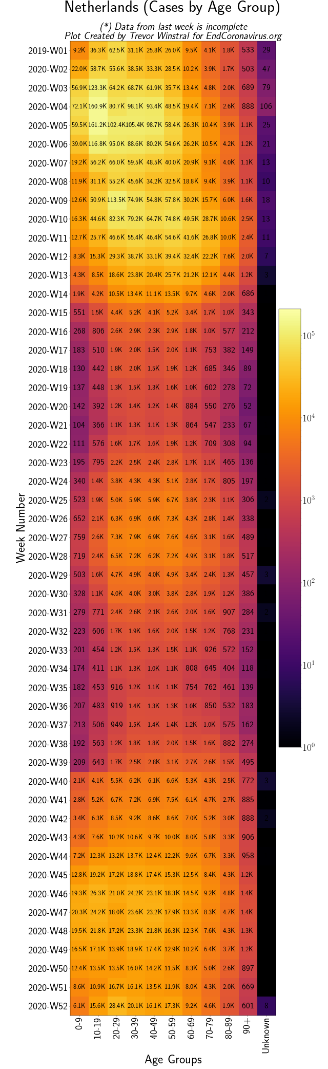 Netherlands Age Groups File
Italian Provinces
Back to top
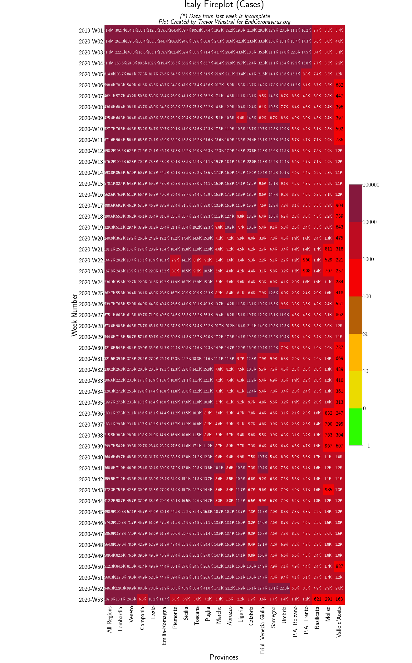 Italian Provinces File
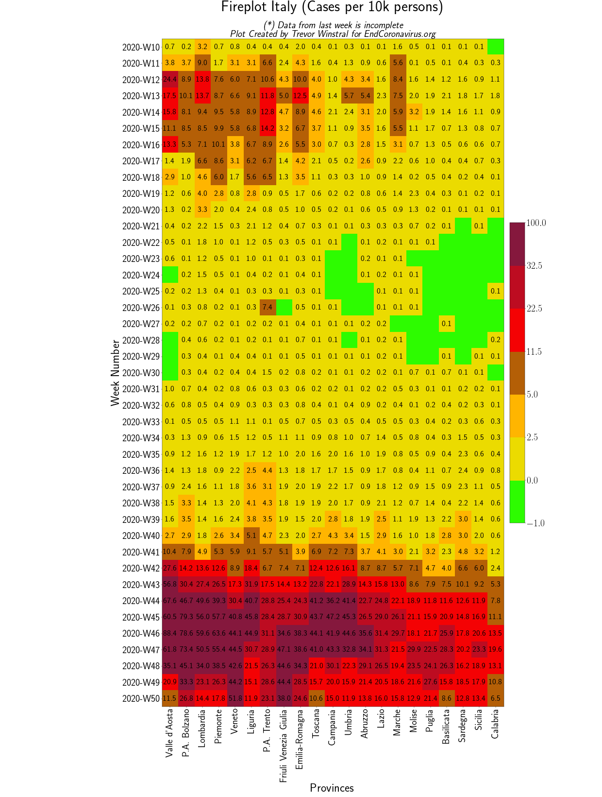 Italian Provinces (Per Capita) File
USA
Back to top
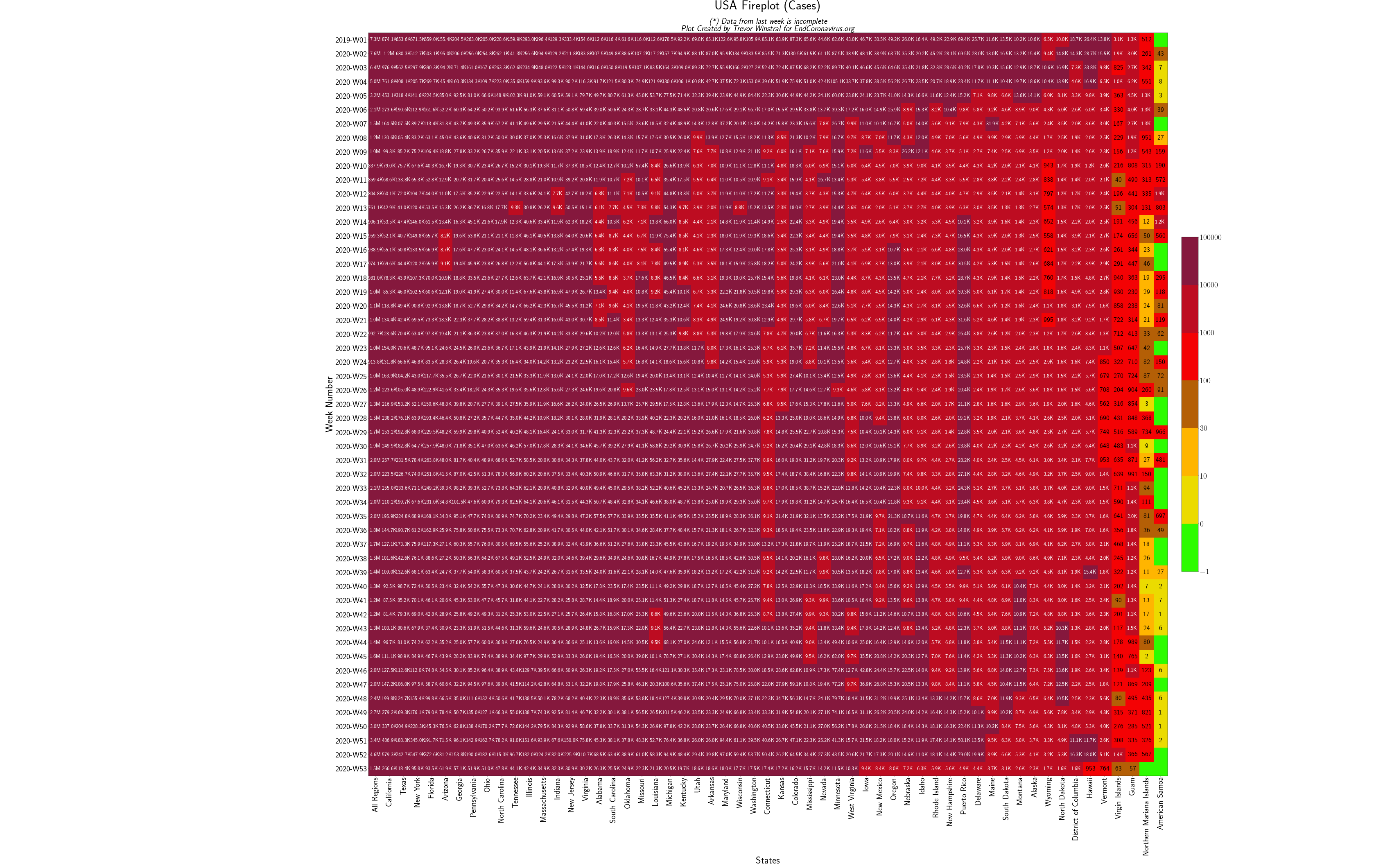 US States (All) File
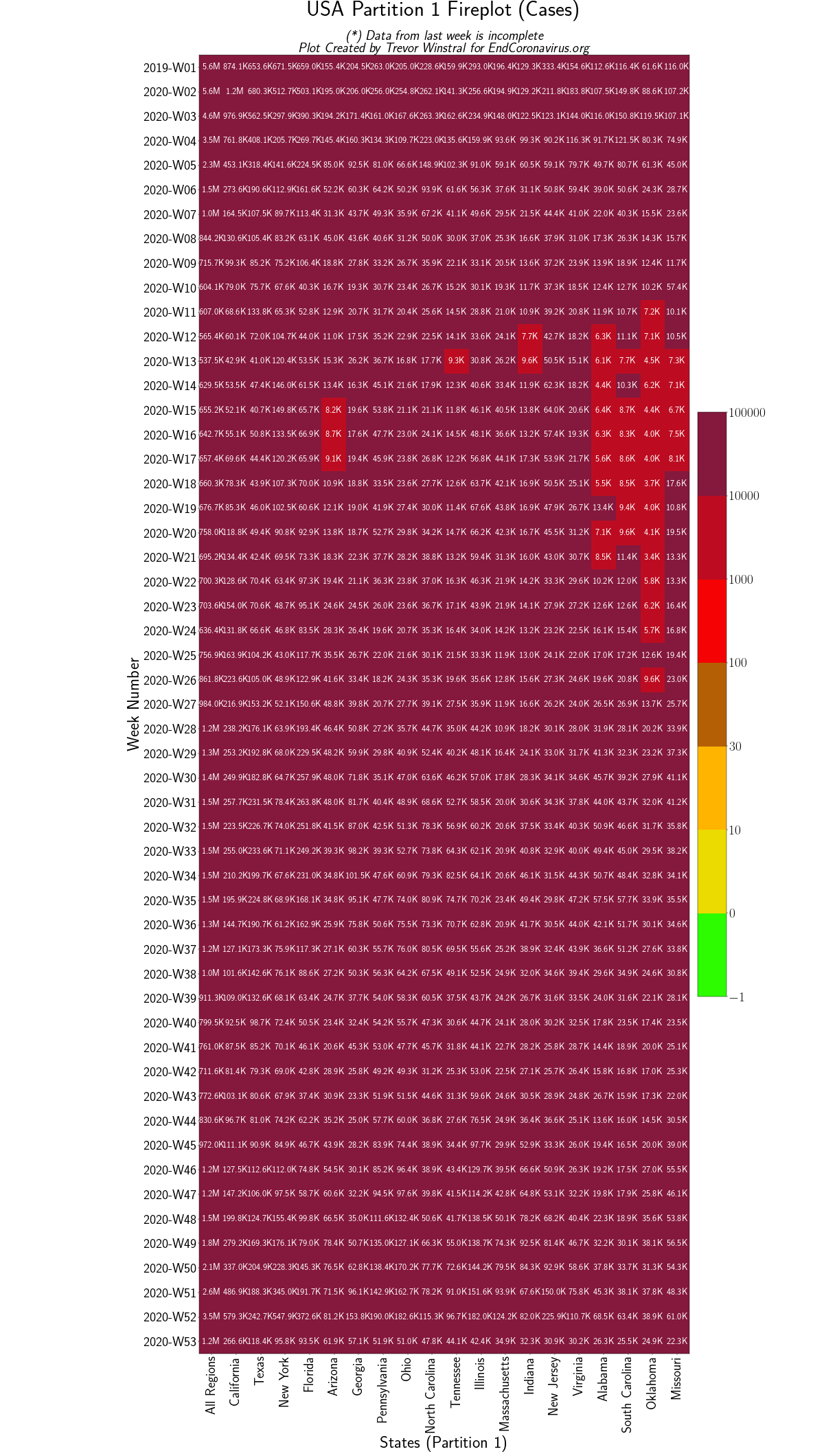 Group 1 File
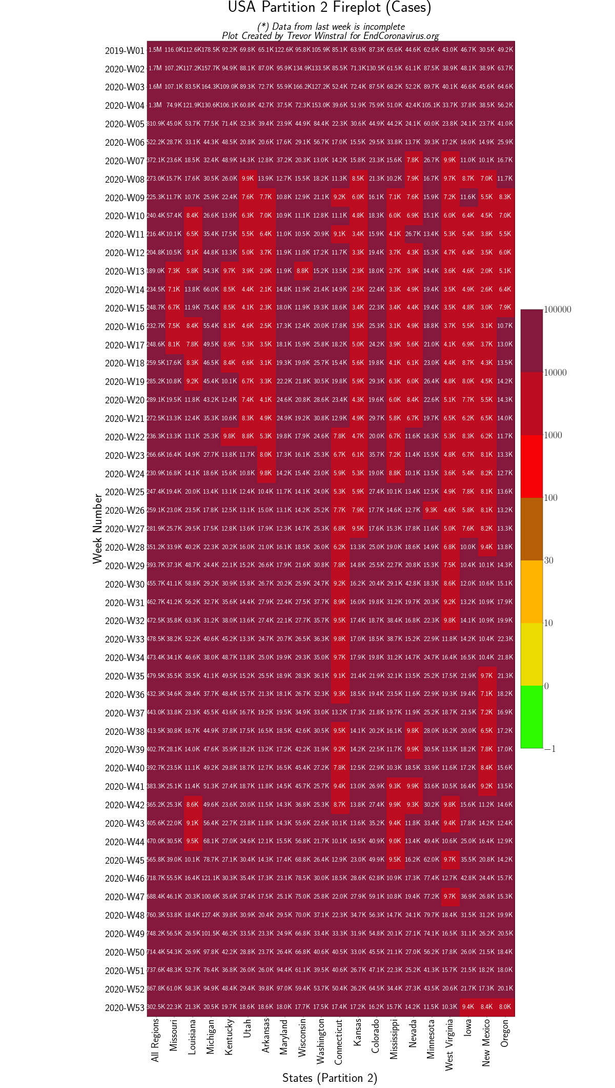 Group 2 File
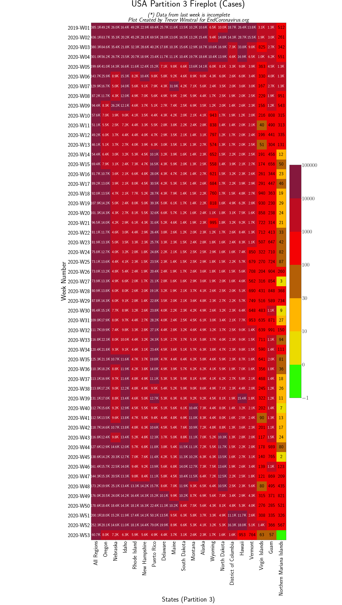 Group 3 File
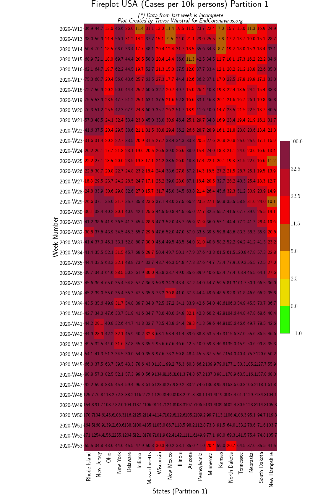 Group 1 (Per Capita) File
 Group 2 (Per Capita) File
 Group 3 (Per Capita) File
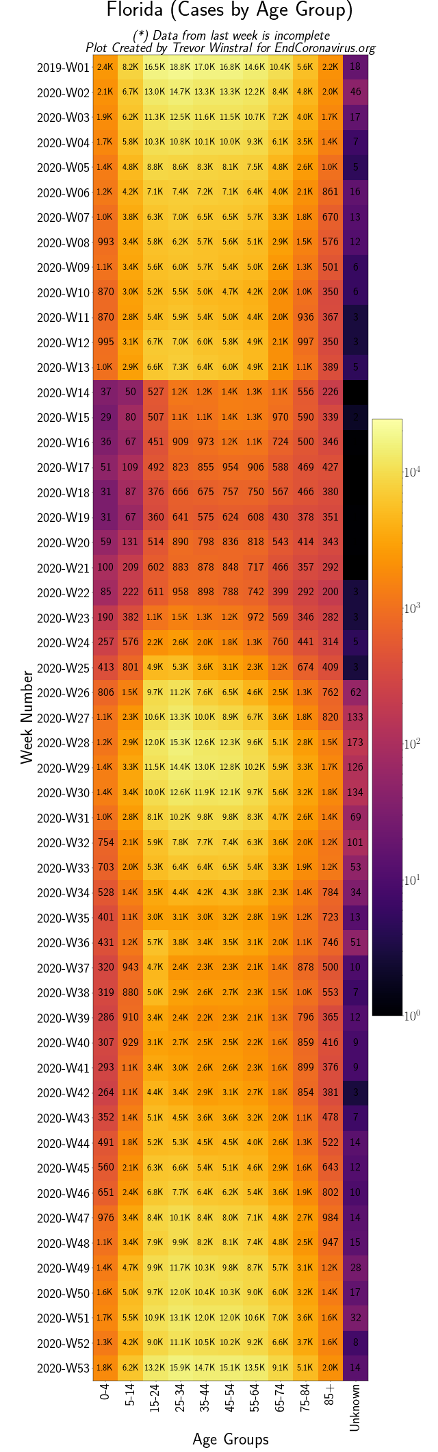 Florida (Age Groups) File
Swedish Provinces
Back to top
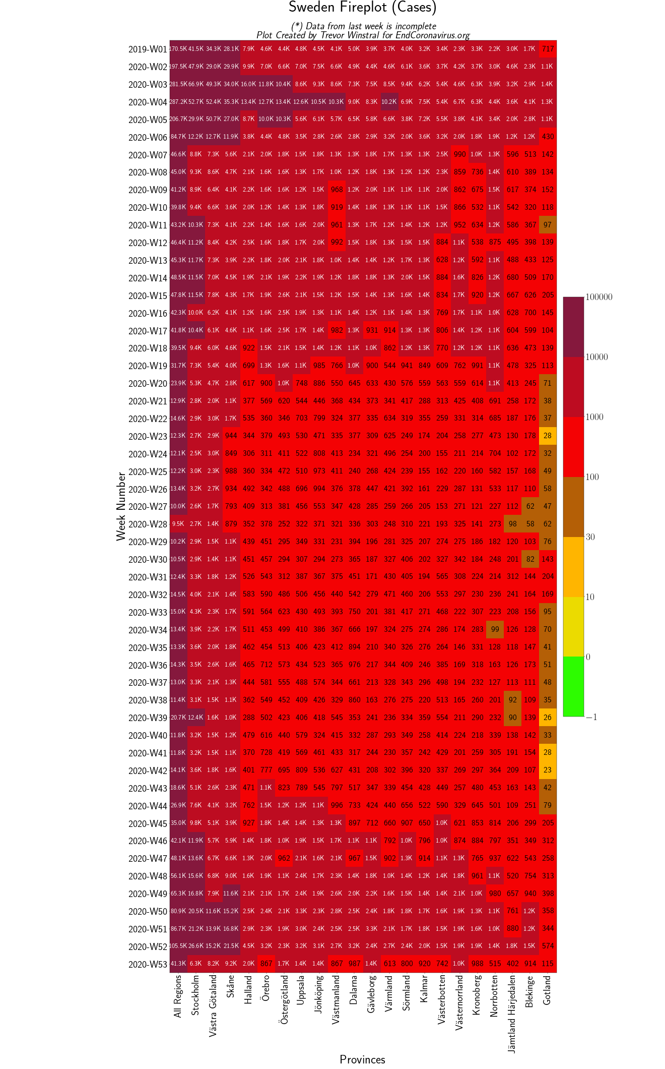 Swedish Provinces File
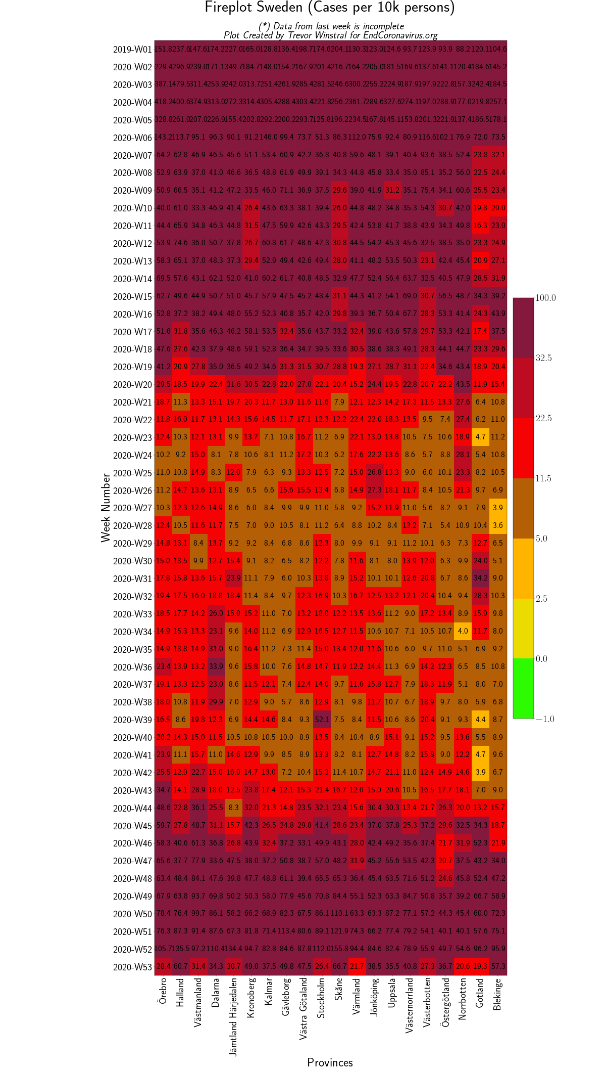 Swedish Provinces (Per Capita) File
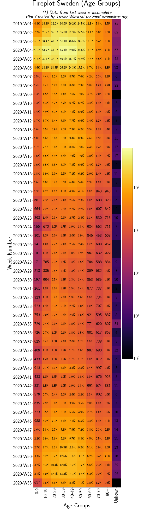 Swedish Age Groups File
Swiss Cantons
Back to top
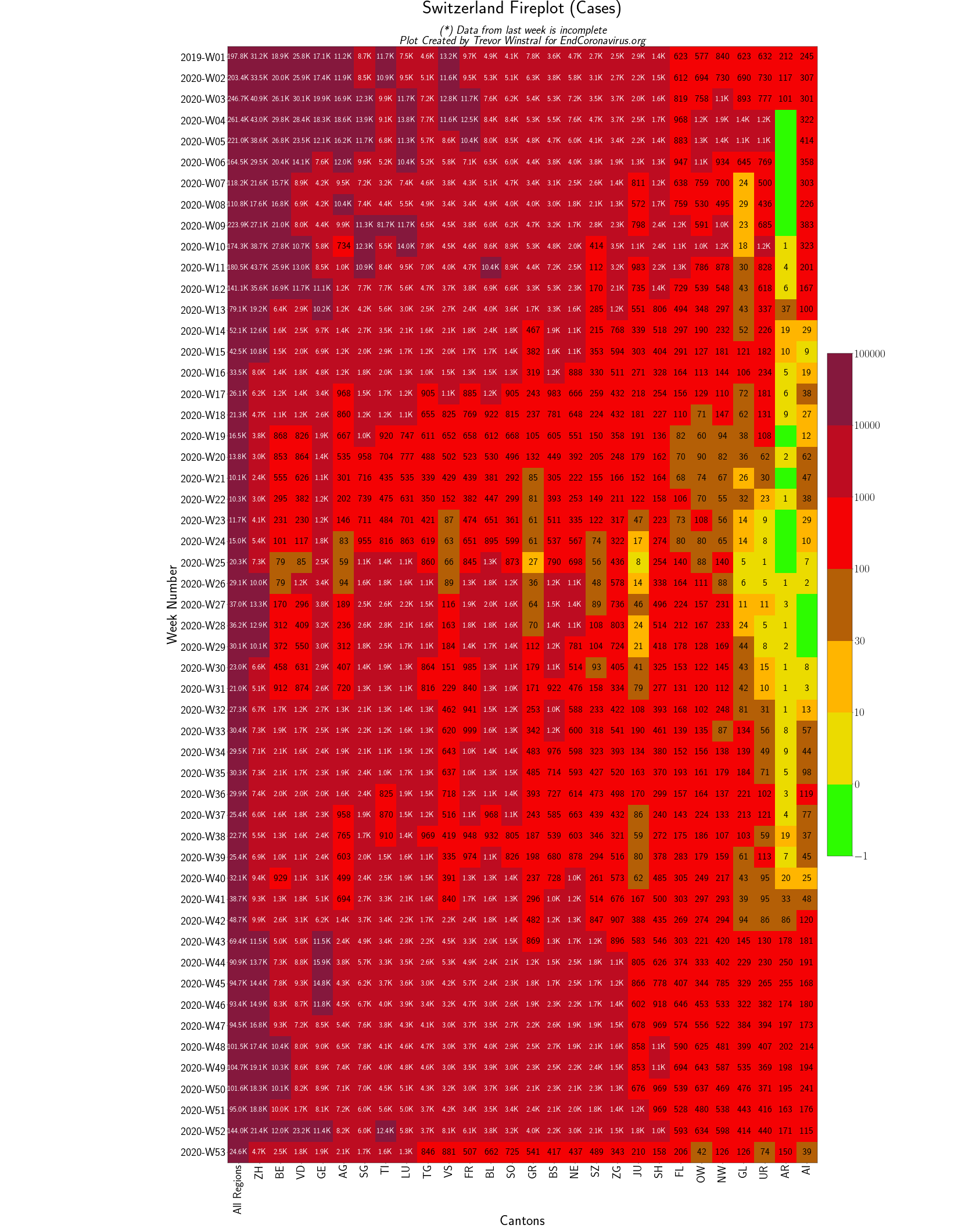 Swiss Provinces File
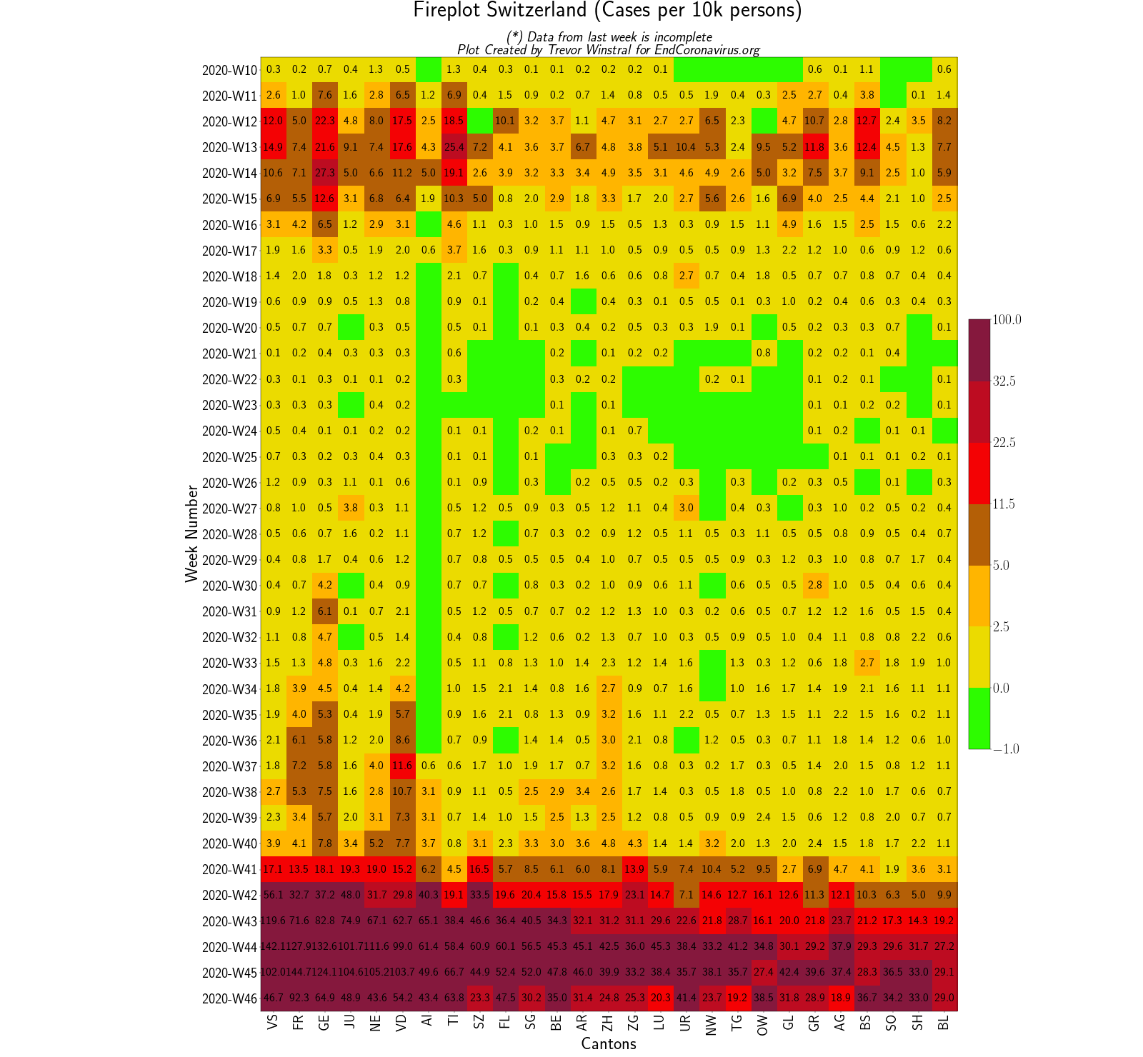 Swiss Provinces (Per Capita) File
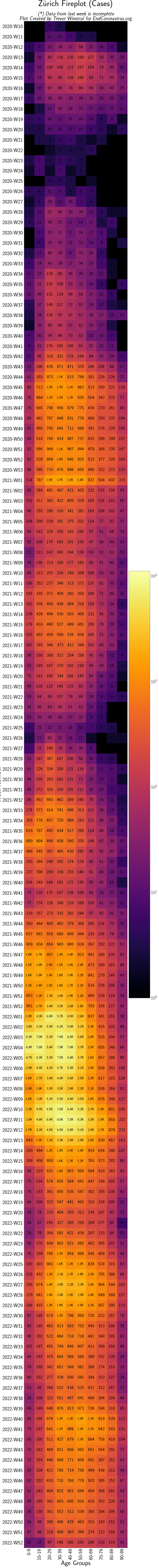 Zürich (by Age Groups) File