Switzerland
The following charts by Thorsten Kurz and Fireplots (heatmaps) by Trevor Winstral are based on the official data published by the Swiss Federal Office of Public Health. After recovering from the 1st wave in springtime Switzerland never defined a target infection rate for itself. It did however define countries or areas with an increased risk of infection as having more than 60 new infections per 100 000 persons in the past 14 days. People having stayed these would have to self-quarantine for 10 days upon entering Switzerland. One would assume that the Swiss cantons too could be expected to remain below this limit, which is why this 14 day incidence became the basis for several visualisations. Later amidst the 2nd wave, "increased risk" was redefined as having a 14 day incidence that was more then 60 above Switzerland's. Cantons Table \ Cantons Diagram \ Cantons Map \ Cantons Bubbles \ Risk by Age \ Positivity \ Group Risk \ Fireplots
 The "Ranking" of the Swiss cantons according to their 14 day incidence. The first line is an indicator for the functioning of the contact tracing: people in quarantine per people in isolation (ongoing infections). The growth indicator in the 4th row uses the difference between two 14 day intervals 1 week apart (stable, but inert and slow to react to changing trends).
 The development in the whole of Switzerland and in the ten most populous cantons. On the logarithmic scale it is easy to recognize that there was a slow but exponential growth during the whole summer. After a brief pause, autumn brought a much steeper exponential growth that was fuelled by the local and federal government's reluctance in implementing measures.
 The daily new cases in each age group combined with the hospitalisations and deaths (both for all age groups). R.I. tries to predict mortality by weighting the new cases by age and sex. All graphs are moving averages over 7 days.
 Under optimal conditions Switzerland can carry out about 40'000 tests per day. This limit has been attained at the end of October 2020. Beware: to easier compare the number of positive tests to the number of total tests a multiplier is used for the number of positive tests.
 There are cantons with a small area and lots of people (Geneva) and there are cantons with a large area and relatively few people (Grisons) and everything in between. This map visualises the incidence in the population of each canton split into different age groups. Since children were officially declared to be immune to the virus or at least not infectious to others, they are usually not tested. Thus they only appear as a grey (foggy) outer circle.
//]: # ( Cantons Bubbles )
 Combining population size, incidence and growth rate. The growth rate uses the difference between two 14 day intervals 1 week apart (stable, but inert and slow to react to changing trends). The colour indicates the positivity rate of the tests, above 10% a lot of cases might go undetected.
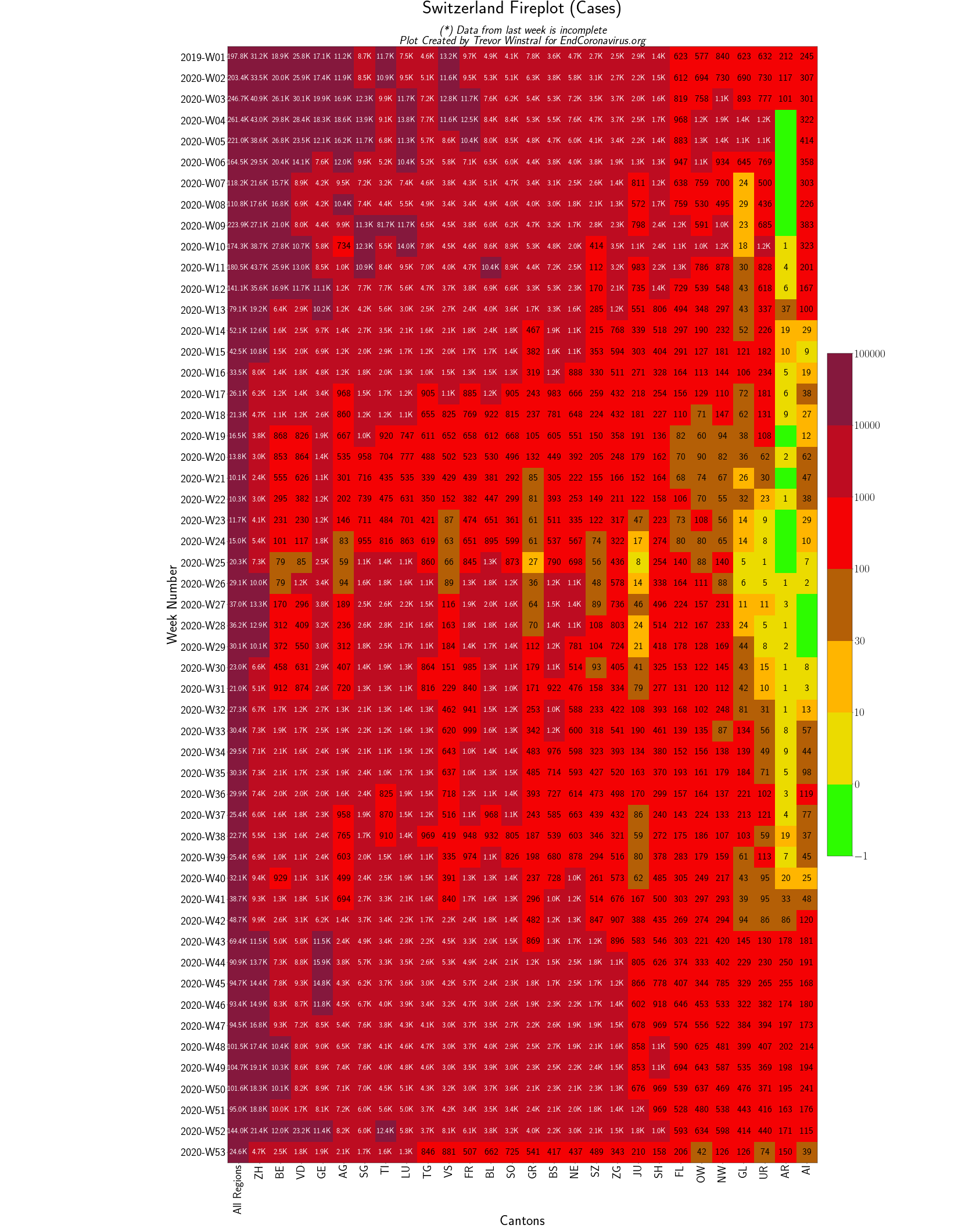
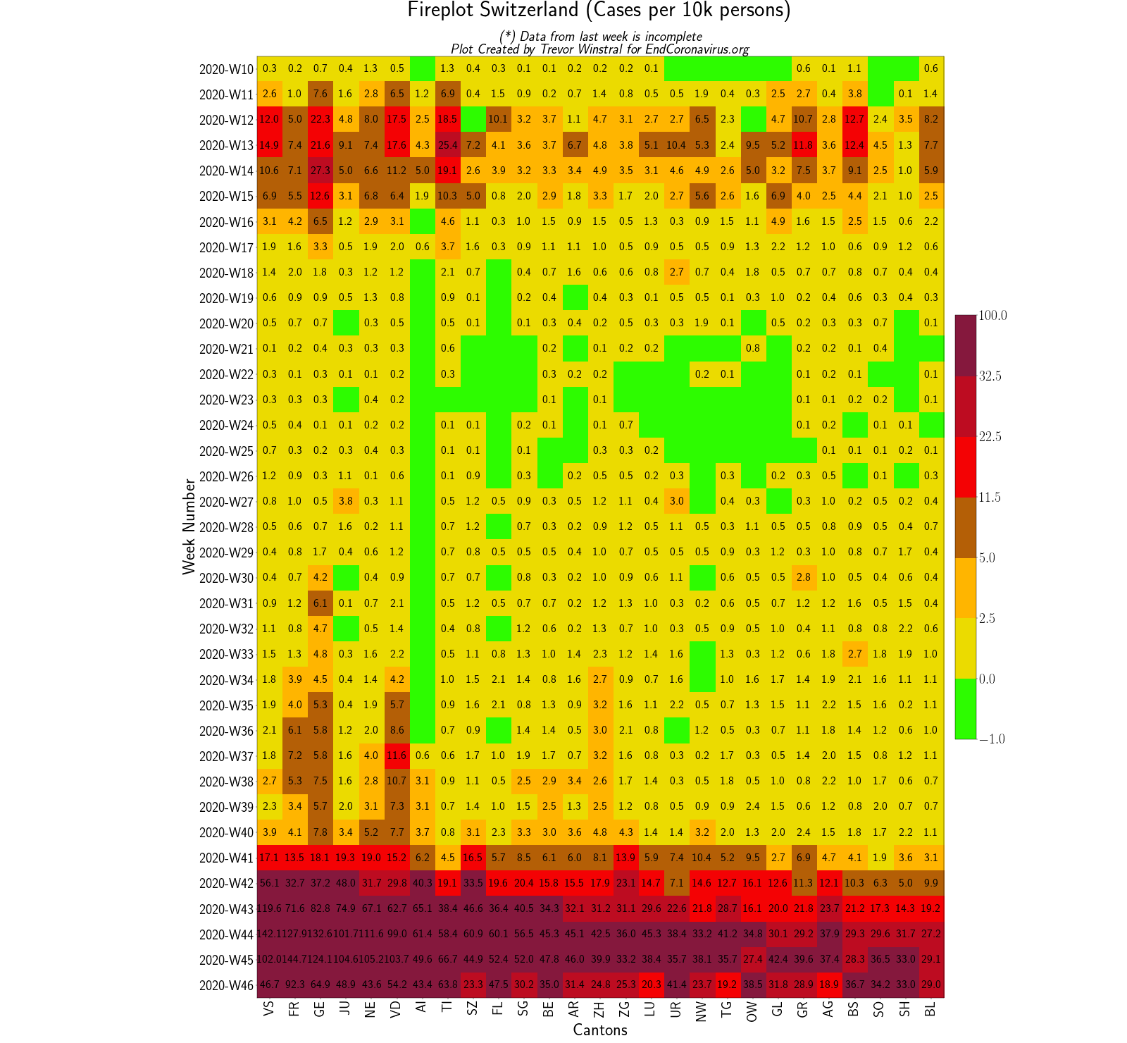
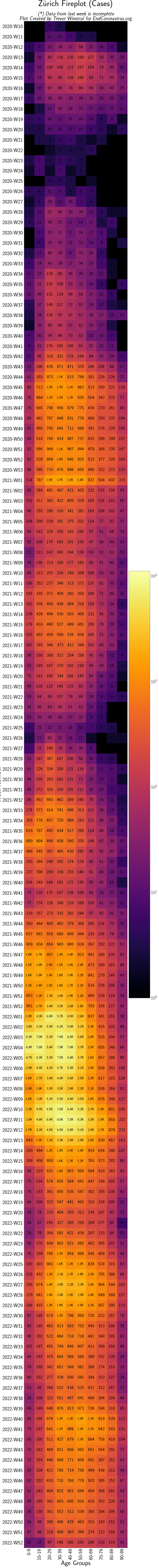
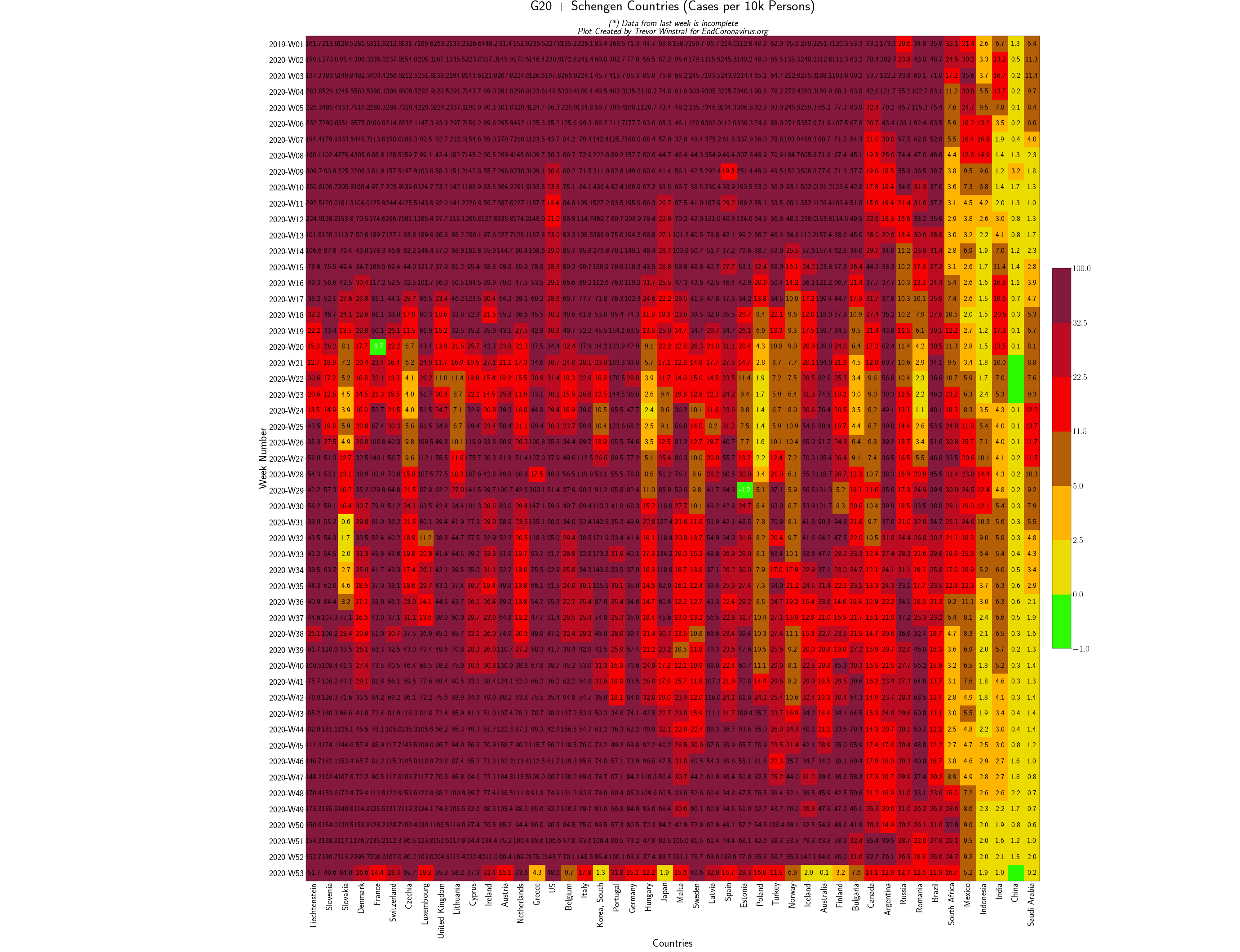
Fireplots
The following are heatmaps to demonstrate the spread of the virus through regions and demographics. For an explanation and more plots see the Fireplots page Image credits: Trevor Winstral data from FOPH (BAG), JHU CSSEI, and World Bank.