
US Mobility trends during the Pandemic
Using cell phone location data, our mobility maps show functional communities over the course of the COVID-19 pandemic in the USA. In Figure 1, the data are grouped by weeks. Each community is marked by a different color. According to these maps, movements of app users are self-organized into multi-scale spatial groups (aka communities). At the top level, we have communities that are close in size to states, but they are not exactly equivalent to the states, rather they often span across several states. In Figure 1, one has the option to show state and county borders, which highlights the differences between states and communities, or counties and communities.
Figure 1. Functional communities and mega-communities over time.
Mega-communities
In Figure 1 you may notice that large communities are combined into mega-communities. Mega-communities are naturally defined travel bubbles, so to speak. The mega-communities are colored with different hues: purple, blue, grey, yellow-brown, pink, and sometimes red. Most commonly, maps in Figure 1 have 5 mega-communities, sometimes 6. Mega-community areas stay more or less constant across all time periods, with some small variations. Some striking variations that we have noticed are 1) Florida and New York belong to the same community at the end of February; 2) in the second week of March, Michigan and New York were in the same community. Such ephemeral community alliances, might explain the spread of COVID during certain time periods. Despite ephemeral inclusions or exclusions, during the majority of the weeks, maps show north-east (purple), south-east (blue), south (pink), mid-west (grey), and the west (yellow-brown). Mega-communities are important because they show how states are interconnected. Knowing these interconnections among communities is important for policy making regarding lifting lockdowns, travel restrictions, etc.
Satellite communities
Some communities have more than one polygon. These are satellite communities. You can find quite a few of those near New York City and New York State. Such communities mean that there are tight connections between them, despite being physically separated by a distance. Satellite communities can be distinguished by color and name.
Small communities
Each large community has a hierarchical structure: they composed of a number of small communities. While maps in Figure 1 show only the outlines of the small communities, Figure 2 allows users to explore small communities that emerged during the week of April 26 - May 2, 2020, which was the end of the lock down in many states.
Figure 2. Small communities and weak ties.
Weak ties
Each group has a large number of connections within their own small and large communities. These relationships define block group's membership in one or another community. However, small communities have relationships with other small communities within the same large community and outside. These connections can be explained by travel or moves to other states. By clicking on any small community in Figure 2 you will be able to see from and to destinations from a selected community. The legend, gives information about the number of relationships to and from each community.
Navigating the small communities
Communities do not have any meaningful names, therefore, we assigned numeric names to large and small communities. Users can explore the locations of communities by clicking on any row in the table next to the map in Figure 2. The table also allows users to sort communities by incoming and outgoing relationships, and search all communities and subcommunities that contain a certain text string, e.g., "Main: 36" etc. The search feature can be useful for understanding the external ties from a particular state, and comparisons of communities.
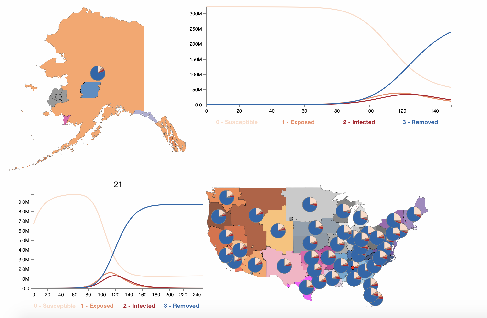
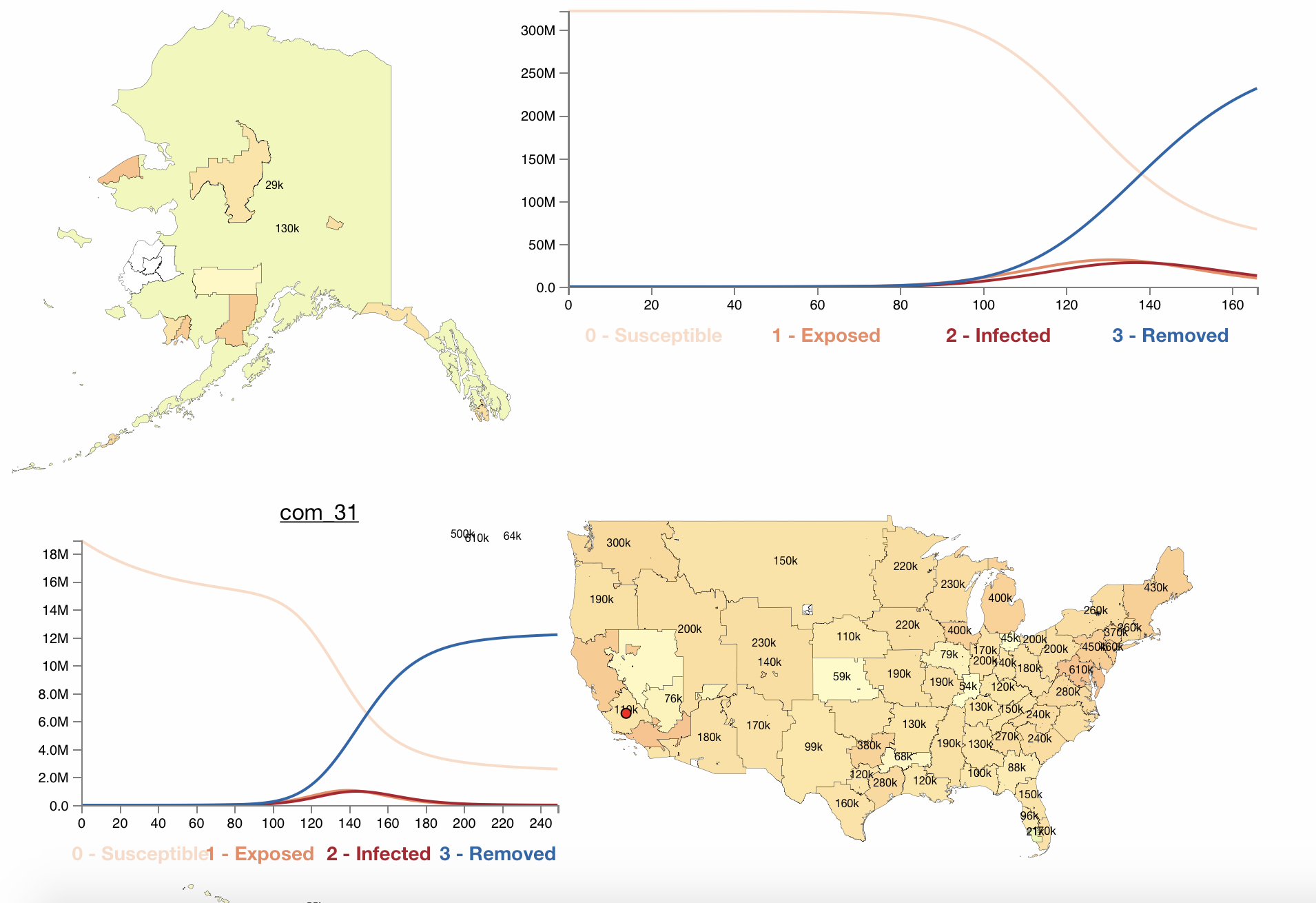
Effects of Lockdowns on communities
To examine the effect of lockdowns on communities, we simulated the propagation of COVID-19 through the main communities before and during the national lockdown in the US in March-April, 2020. For the simulation we used Susceptible, Exposed, Infected, and Removed (SEIR) model, frequently used in public health for estimation of disease spread. We For the first simulation we used communities and mobility data from February 23-29, 2020. For the second simulation we used communities and mobility data from March 29 - April 04, 2020. For each of these weeks, we made two visualizations: 1) where maps show only the spread of COVID-19; 2) where maps show distributions of SEIR parameters by means of pie charts.
February 23-29, 2020 simulation
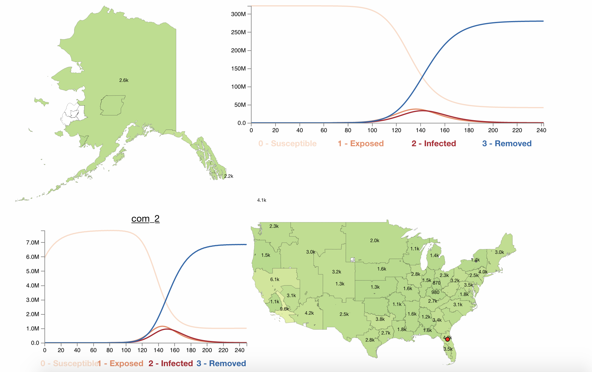
Follow this link to explore February 23 - 29, 2020 simulation.
March 29 - April 04, 2020 simulation
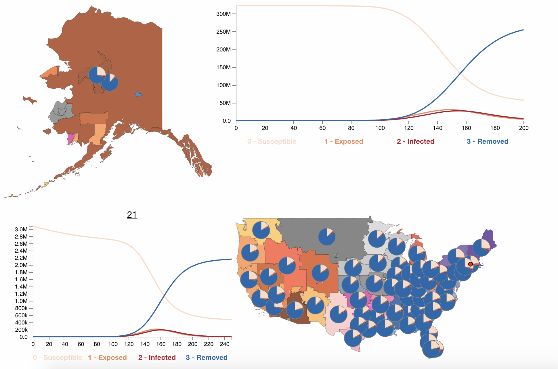
Follow this link to explore March 29 - April 04, 2020 simulation.
Differences between contagion levels in communities before the lockdown (February 23 - 29, 2020) and after the lockdown (March 29 - April 4, 2020)
The plots above show that regardless of what community infection starts before the lockdown, the level of infections in the country will be higher than during the lockdown (also regardless where the infection starts). In addition, lockdowns postpone peaks of indection rates.
Principal Investigators: Leila Hedayatifar and Yaneer Bar-Yam from NECSI.
Visualizations developed by Olha Buchel and Leila Hedayatifar.
NSF Award Number: 2032536
Publications:
- Buchel, O., Ninkov, A., Cathel, D., Bar-Yam, Y., Hedayatifar, L. Strategizing COVID-19 Lockdowns Using Mobility Patterns. . NSF Report
- Buchel, O., Ninkov, A., Cathel, D., Bar-Yam, Y., Hedayatifar, L. (Under review). Strategizing COVID-19 Lockdowns Using Mobility Patterns. Royal Society Open Science.
- Buchel, O., Bar-Yam, Y., Hedayatifar, L. 2021. The Role of Mobility Patterns in the Formation of Bubbles During the COVID-19 Pandemic. In Alfredo J. Morales, Joseph Norman, Mads Bahrami (eds.), COVID-19: A Complex Systems Approach. STEM Academic Press.